in cahoots with CAHOOTS
16 Jan
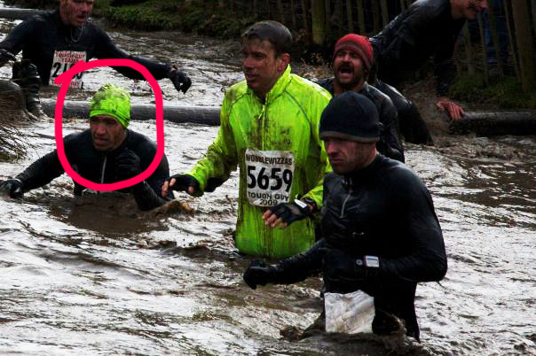
Recently we have had the privilege of working with Devon Anderson who is building a brand for his awesome extreme duo challenge race – CAHOOTS! Devon (circled in bright pink) is part of an elite group of people who are already bored with marathon running, and need to spice up their athletic past time a bit! These fellers do obstacle challenge races. The first one, “Tough Guy”, started a long time ago in england involves 4 or more hours of sloshing around in arctic freezing muddy water, razor barbed wire, electric wires, fire, jumping off of tall stuff, balancing on stuff, bottomless pits, plank walking, and all other sorts of self deprecating mad tough viking nonsense.
Since then, america has seen quite a few duplicates and copy cats of the original tough guy race (tough mudder, ragnar relay, rugged maniac, spartan race, etc.) Devin, a close friend of the rugged maniac who started the original tough guy race, asked permission if he could start a brand of tough guy in the states and was granted it. However the crazy legalities of near death obstacle challenge racing didn’t really go over in the new world. So Devon decided to start his own brand of military-esque self mutulating thrill seeking. Devon decided that he wanted to make a challenge course with a bit of a twist –> CAHOOTS is designed to challenge a pair, a partnership, with challenges that are designed primarily to be completed by 2 people.
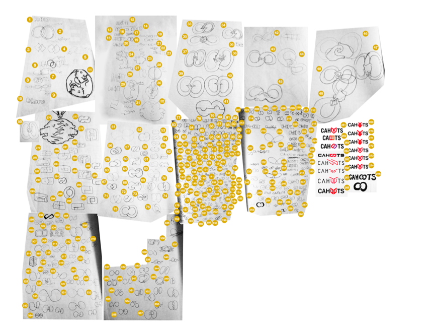
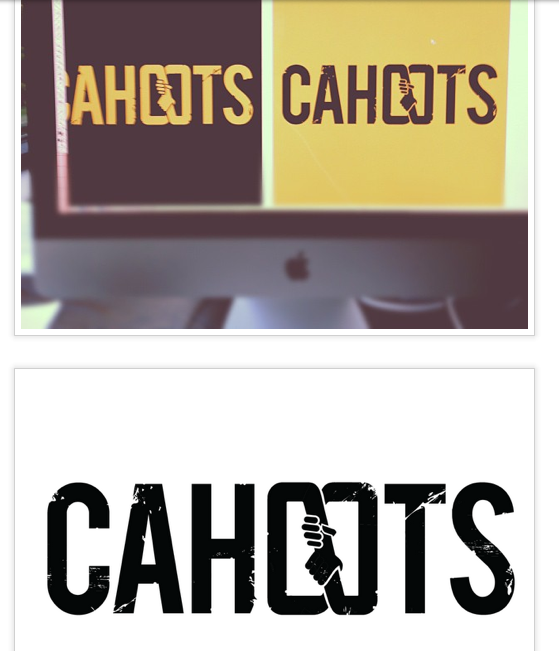
Devon approached Vada and asked us to help him create a brand for CAHOOTS this december and the result has been really awesome. We worked on the logo for a crazy powerhouse period, working together closely with Devon. We went through LOTS (maybe more than 300) of iterations until we found the perfect icon that would communicate the rugged team work ideal of cahoots. We felt that there was an opportunity to use the double o’s in the word, to create something smart and catchy:
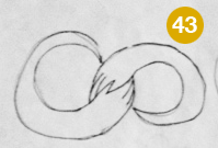
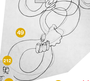
Those turned into these:
Which eventually and finally turned into this:
From there, everything was smooth sailing. Our old friend BEBAS was chosen for typography and Gold and black were chosen as the color scheme.
And now we are working on their website. Which has been awesome and flown naturally out of the brand we worked so hard on. Deciding to ding up and distress the type was an important decision. Without going over the top (super death metal barbed wired masculinity overload) it makes the brand feel rugged, rough and fun. You’ll be seeing lots more work, as we continue a great relationship with CAHOOTS!




No comments yet